care together
care together
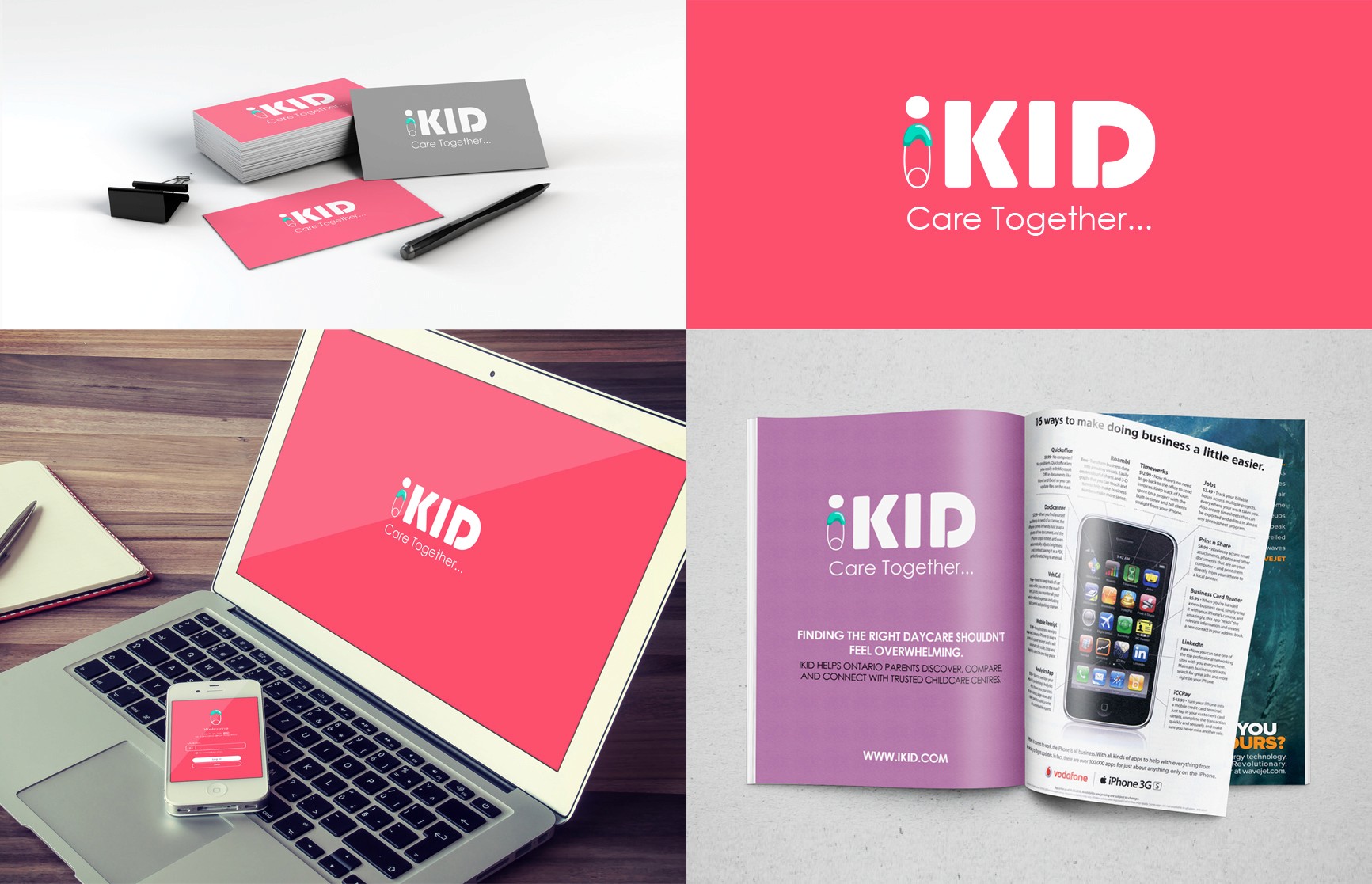
iKID was created to make finding daycare centres easier and less stressful for Ontario parents. The project included logo design, brand identity, marketing materials, and digital applications across print and mobile platforms.
The visual system focused on warmth, clarity, and simplicity, creating a modern and approachable brand experience that could easily grow across different touchpoints.
Nilaco
Nilaco
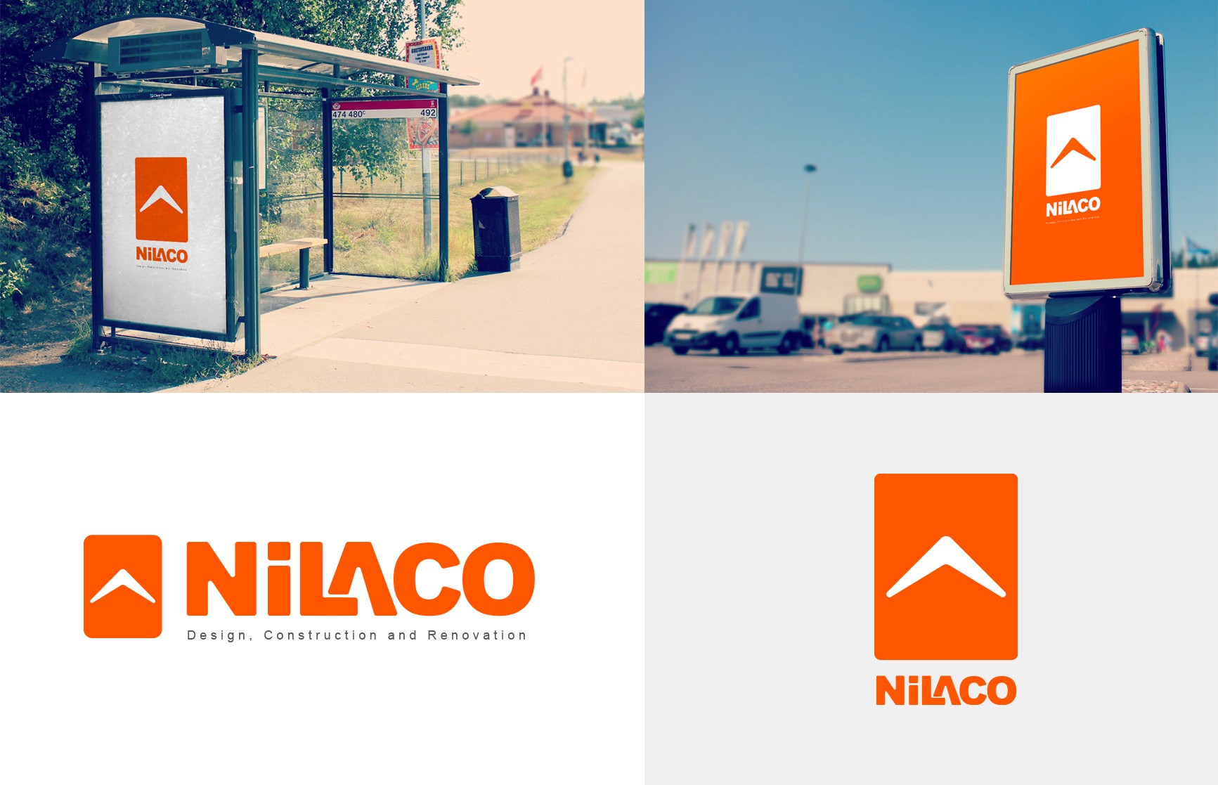
Nilaco’s brand identity was built around simplicity, structure, and visibility. The project included logo development, signage, typography, and visual identity applications across print and environmental touchpoints.
The bold geometric symbol and strong color palette were designed to keep the brand recognizable, scalable, and highly visible across both digital and real-world environments.
majan
majan
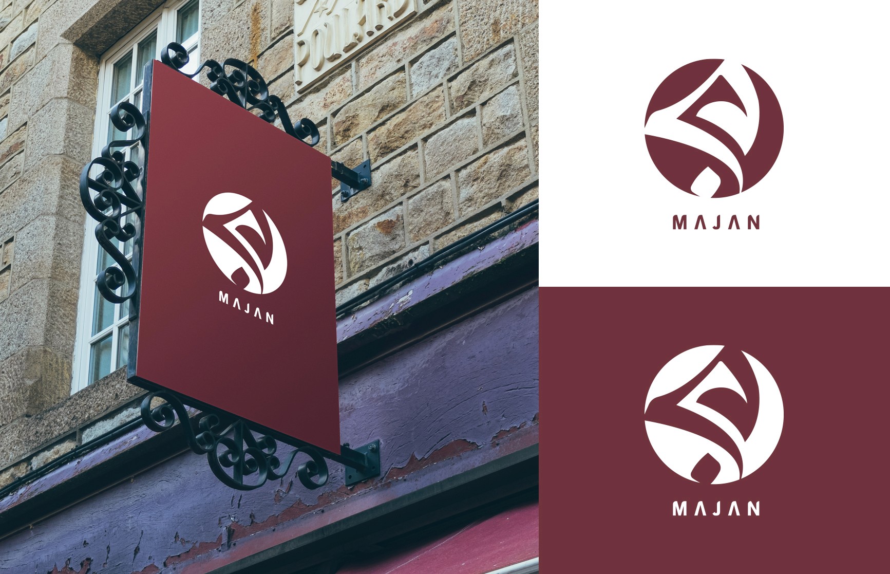
Majan was developed as a visual identity for an event and ceremony planning brand focused on weddings and formal gatherings. The project included logo design, color exploration, and brand applications across signage and promotional materials.
The visual direction combined soft curves with a modern emblem structure to create a brand presence that feels elegant, welcoming, and memorable across both physical and digital environments.
ttp group
ttp group
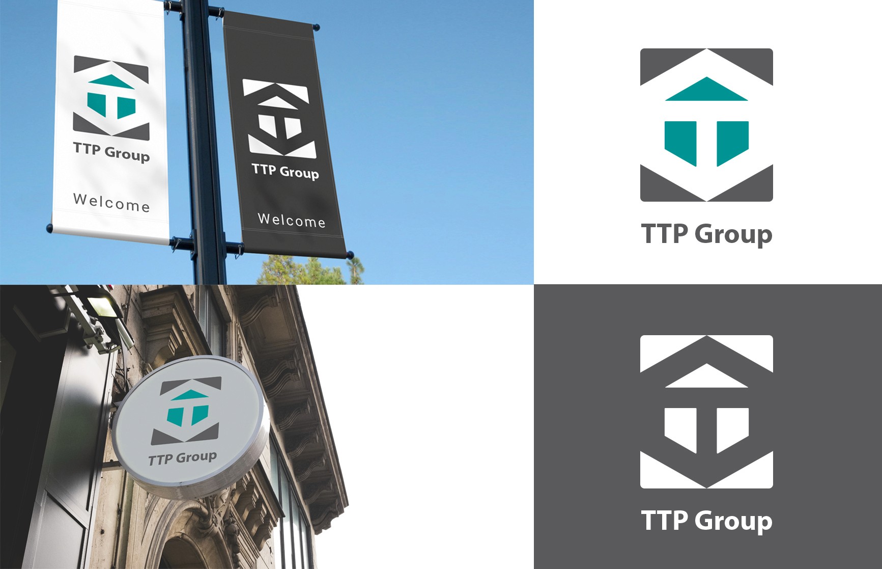
TTP Group’s visual identity was developed for a large-scale construction and development company focused on modern building projects. The project included logo design, brand system development, signage, and environmental identity applications across public-facing touchpoints.
The geometric symbol and industrial-inspired visual language were designed to create a brand presence that feels strong, scalable, and highly recognizable across both corporate and construction environments.
rose villa
rose villa
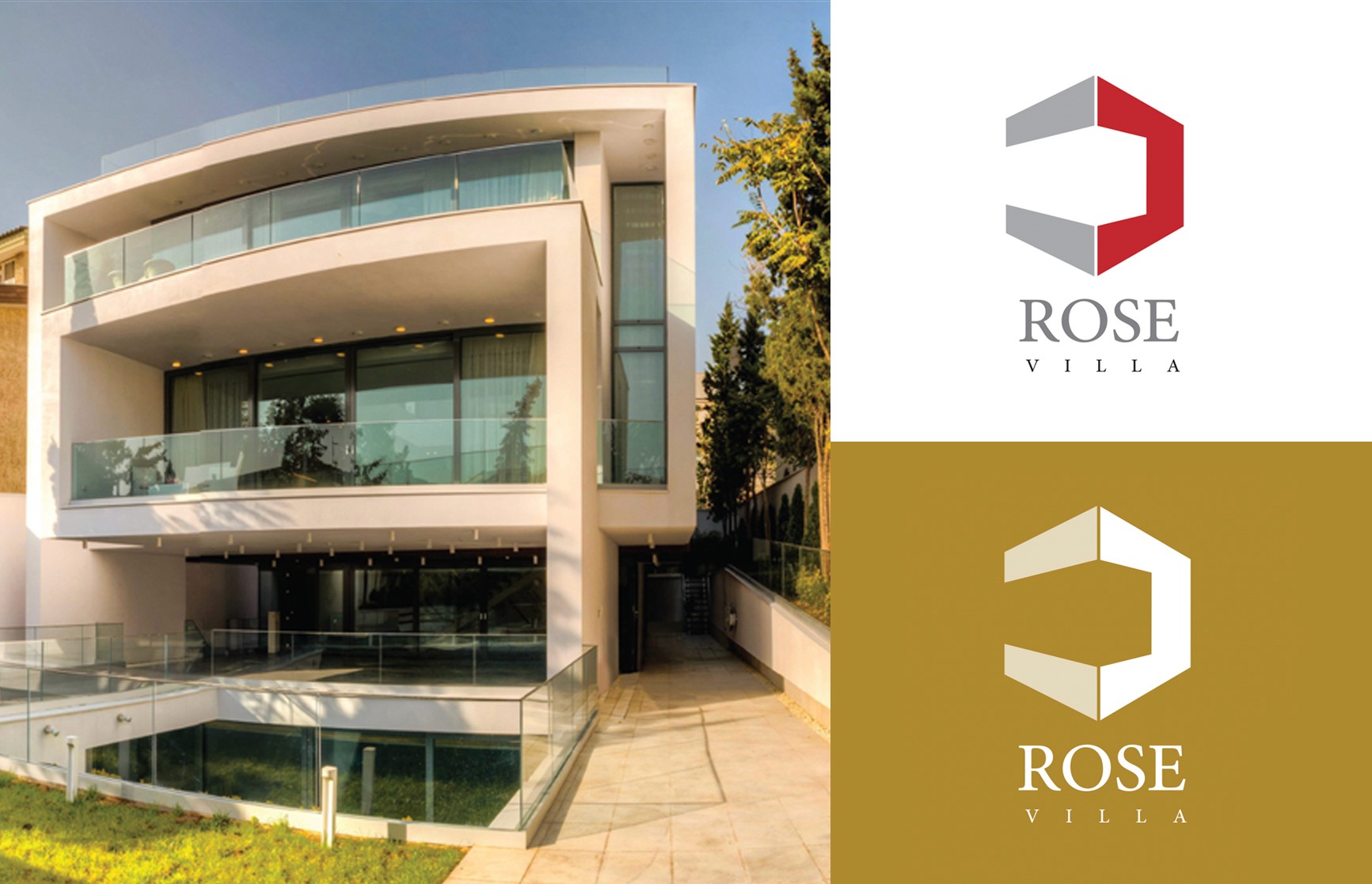
Rose Villa’s identity was developed for a modern luxury construction brand focused on high-end residential architecture. The project included logo design, visual identity exploration, and environmental brand applications across print and physical spaces.
The minimal geometric symbol and restrained color palette were designed to create a refined and timeless brand presence that reflects precision, elegance, and contemporary architectural design.
Lm law & cpa
Lm law & cpa
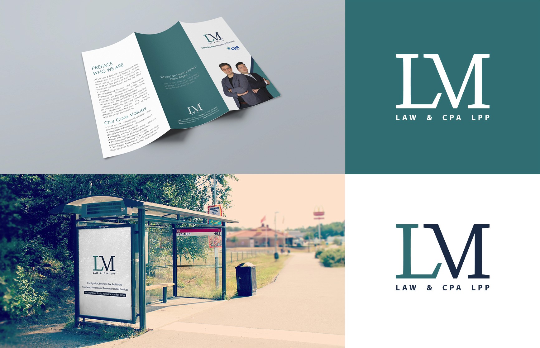
LM was developed as a visual identity for a multidisciplinary consulting firm offering legal, immigration, accounting, and advisory services. The project included logo design, brand identity development, editorial materials, and environmental applications across print and public-facing touchpoints.
The visual direction focused on clarity, structure, and restrained typography to create a professional and modern brand presence that works consistently across both legal and financial environments.