blu bank
blu bank
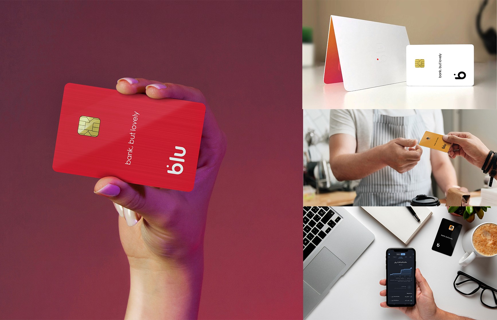
Blu was one of the largest and fastest-growing neobanks in Iran, built around the idea of making banking feel simpler, friendlier, and more human.
As part of the brand and product experience team, I worked across visual identity, campaign design, digital experiences, and physical brand touchpoints, including Blu’s card system and packaging.
One of the most recognizable parts of the brand was its collection of seven different card colors, allowing users to choose a card that matched their personality rather than treating banking as something cold and uniform. The visual direction combined minimal design with a more emotional and lifestyle-driven approach, helping Blu stand apart from traditional banking brands.
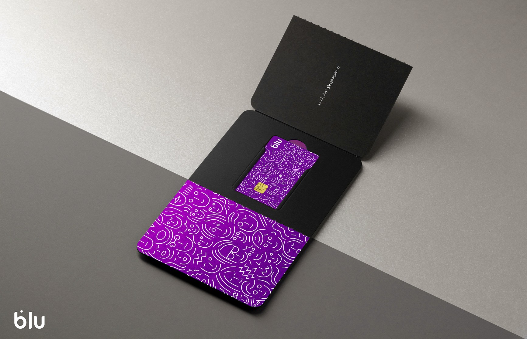
blu junior
blu junior
Blu Junior was designed as a banking experience for users under 15, built around the idea that financial products for younger audiences should feel playful, personal, and emotionally engaging rather than overly corporate.
The project included card design, packaging, and visual identity elements created specifically for Blu’s younger user base. The expressive illustrations, vibrant colors, and collectible-style presentation were designed to make the experience feel closer to a lifestyle product than a traditional banking service, while still staying consistent with Blu’s minimal brand language.
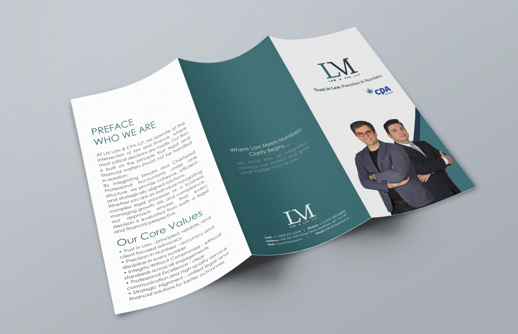
lm
lm
LM was developed as a visual identity system for a multidisciplinary firm offering accounting, immigration, refugee, legal, and advisory services. The goal was to create a professional and trustworthy brand presence that could work consistently across both corporate and public-facing environments.
The project extended far beyond logo design and included brochures, stationery, business cards, envelopes, banners, billboards, presentation materials, and large-scale print applications. The visual direction focused on clarity, structure, and clean typography, helping the brand feel modern, approachable, and reliable across a wide range of touchpoints.
hamrah aval
hamrah aval
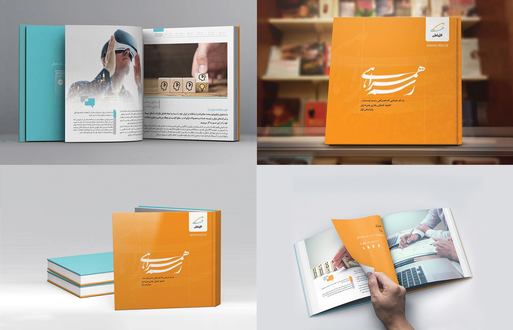
This annual report was designed for Hamrah Aval, the largest mobile operator in Iran. The project focused on transforming complex corporate and technological information into a cleaner, more approachable editorial experience through structured layouts, modern typography, and minimal visual hierarchy.
The work included cover design, editorial layout systems, infographics, and print production across multiple sections of the publication. The visual direction balanced corporate credibility with a more contemporary and human presentation, helping the content feel clearer, lighter, and easier to navigate despite the large amount of information.
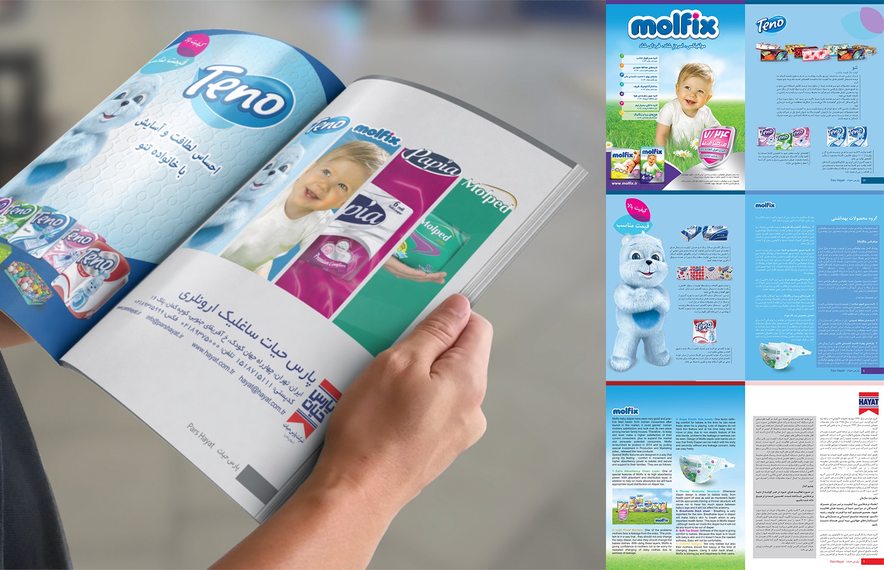
molfix
molfix
Molfix was one of the leading baby care and hygiene brands in the region, and this project focused on building a large-scale editorial and print communication system across multiple product categories including diapers, tissues, and hygiene products.
The work included magazine layouts, product presentations, promotional spreads, packaging visuals, and print-ready editorial design. Because the brand operated at a high retail volume, the visual system needed to balance clarity, product visibility, and emotional appeal while remaining consistent across a wide range of printed materials and campaigns.