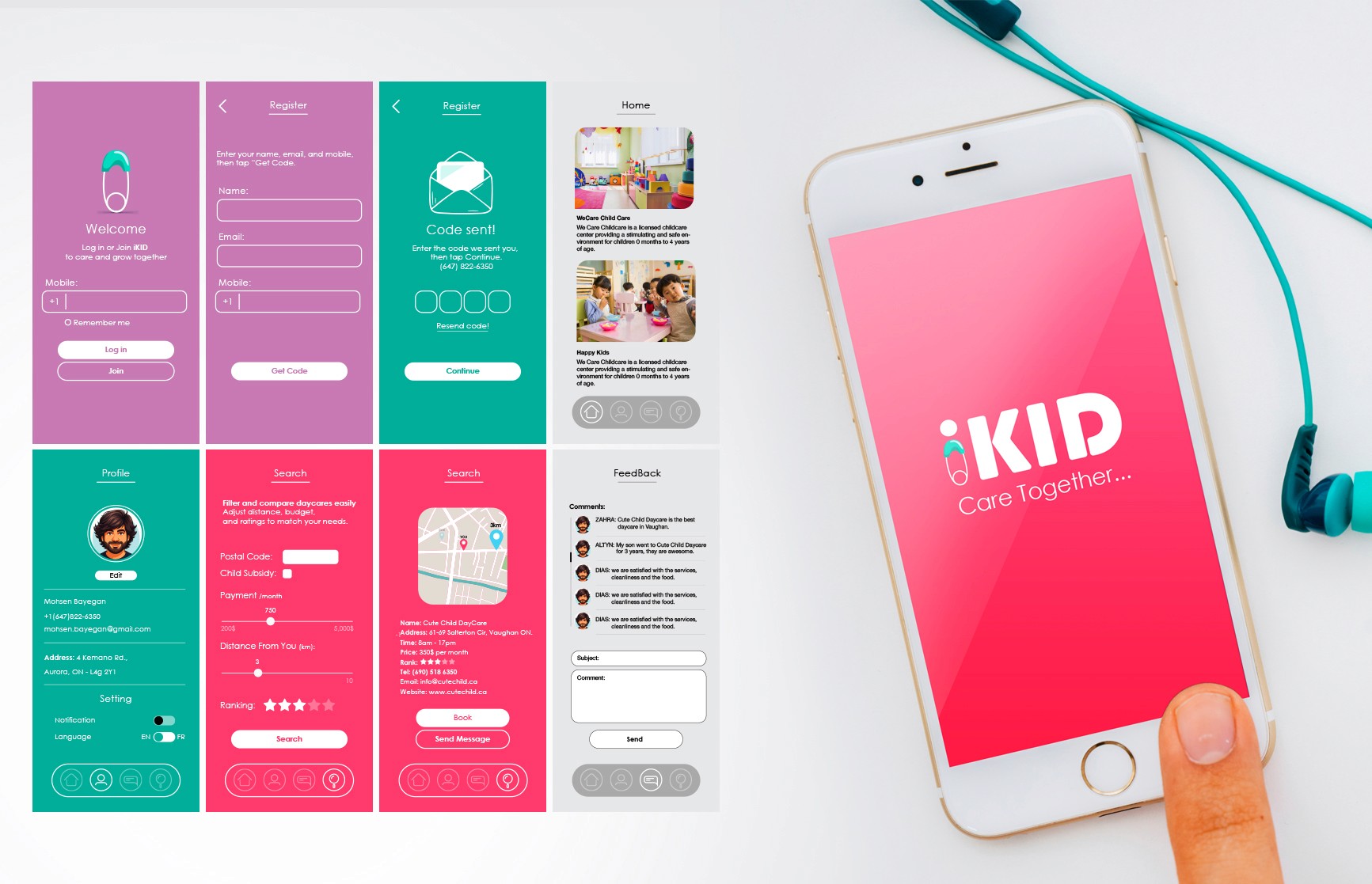
iKID was designed to make the search for daycare feel simpler, warmer, and less overwhelming for parents. The platform combined mobile UI, branding, and user experience into a system that felt approachable, friendly, and easy to trust.
Rather than treating childcare as a cold directory experience, the visual direction focused on softness, clarity, and emotional comfort, creating a product that feels supportive during one of the most important decisions parents make.
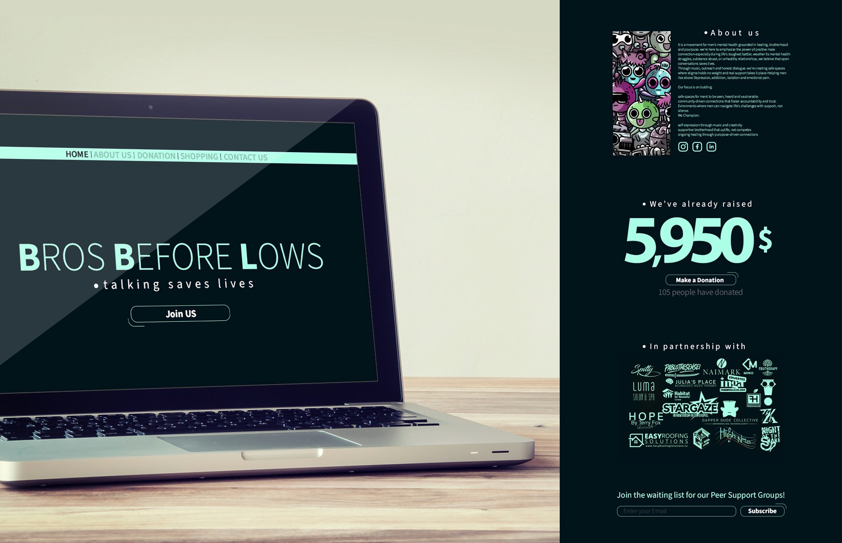
Bros Before Laws was designed as a community-driven platform focused on men’s mental health, support, and conversation. The project combined website design, branding, and digital communication into a visual system that felt modern, approachable, and emotionally open without becoming overly heavy or clinical.
The goal was to create a space that encourages connection and visibility, using clean typography, bold contrast, and a minimal interface to support a message built around honesty, support, and human connection.
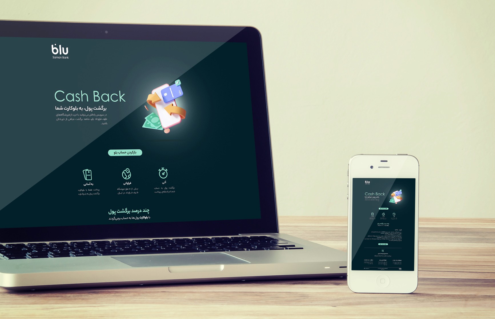
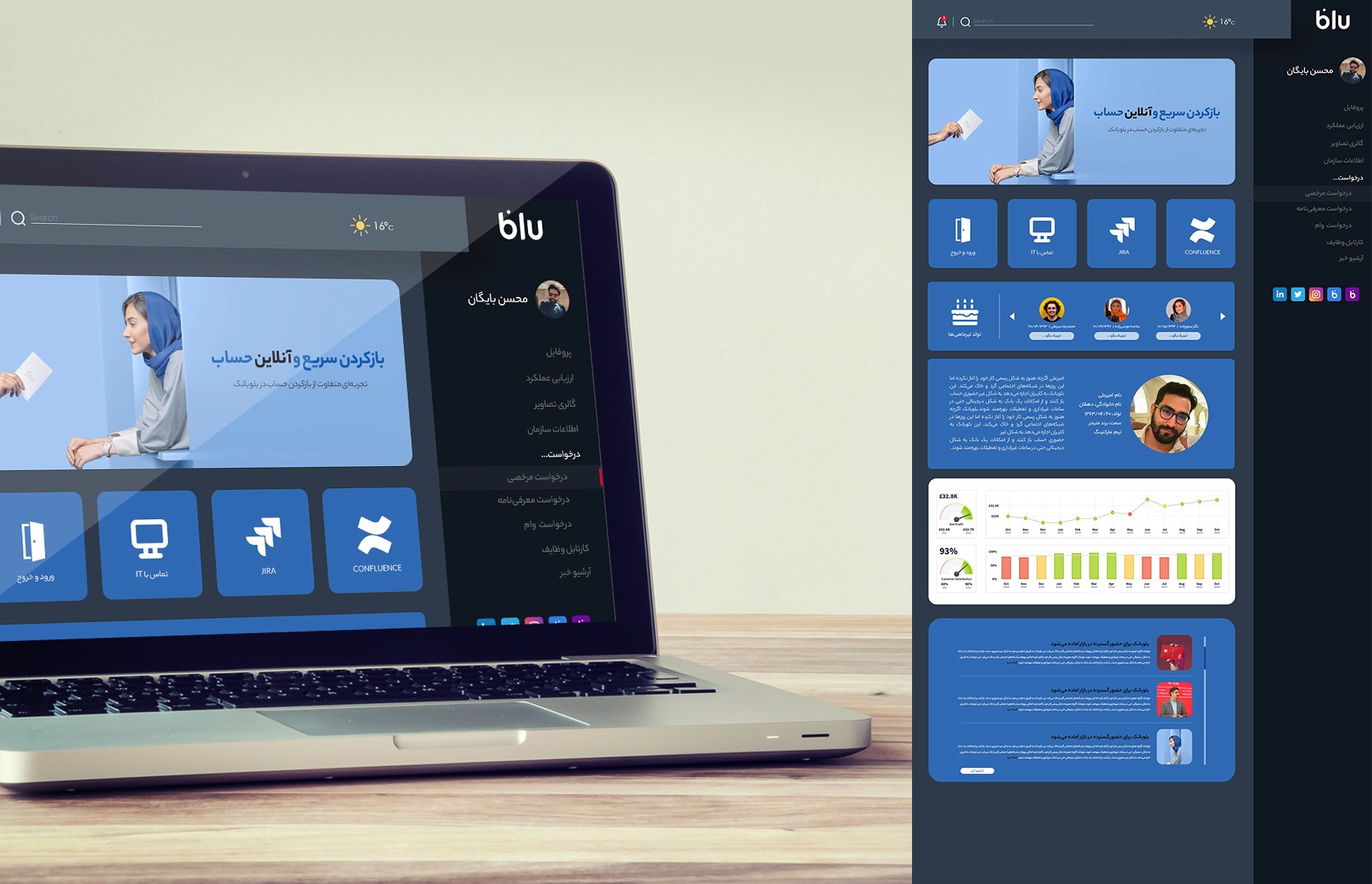
Blu Portal was designed as an internal communication and operations platform for BlueBank, bringing together announcements, administrative tools, internal services, and team connectivity within a single digital environment.
The interface was built around clarity, accessibility, and speed, helping employees navigate daily workflows more easily while keeping the experience visually aligned with BlueBank’s modern digital identity. Rather than feeling like a traditional corporate intranet, the portal was designed to feel lighter, more human, and more connected to the culture of the brand itself.
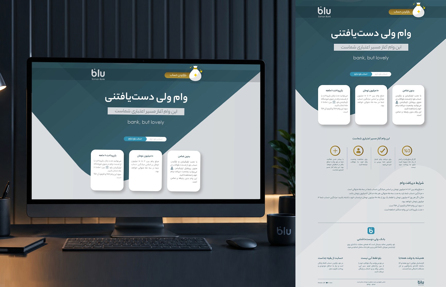
Blu Loan was created as a campaign to introduce BlueBank’s digital loan service in a simpler and more approachable way. The project focused on turning a typically complicated banking process into a cleaner and more human digital experience, emphasizing accessibility, speed, and ease of use.
The visual direction combined minimal UI structure with BlueBank’s soft geometric language to create a campaign that felt modern, trustworthy, and lightweight rather than overly corporate or intimidating.